More in


Anfas Collection · Brand Strategy, Identity, Digital & E-commerce @anfascollection
Anfas is a niche perfume house rooted in heritage, translated into a contemporary rhythm. We partnered with the brand to refine its identity across every touchpoint — from brand strategy and packaging to digital experience and e-commerce.
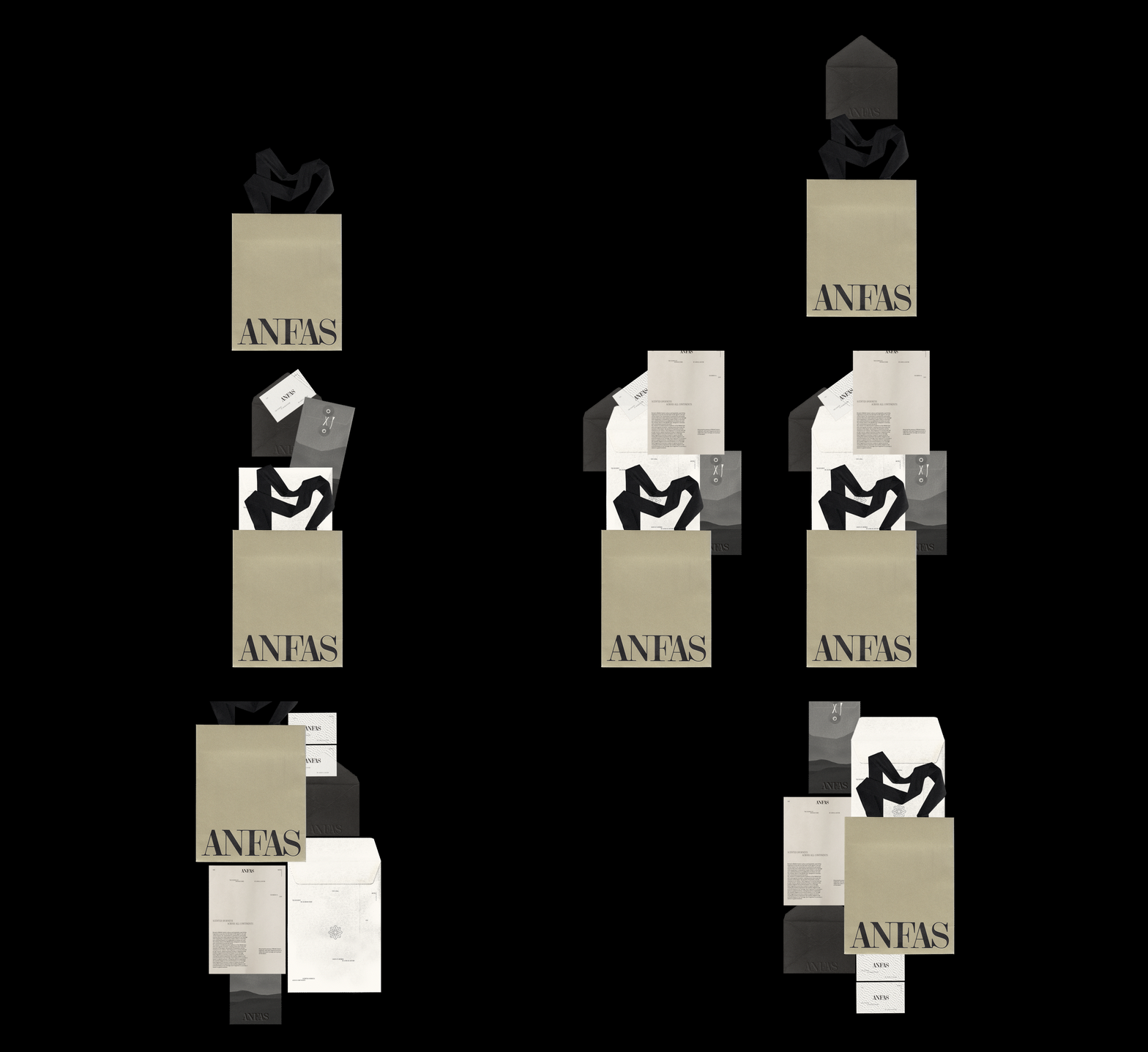
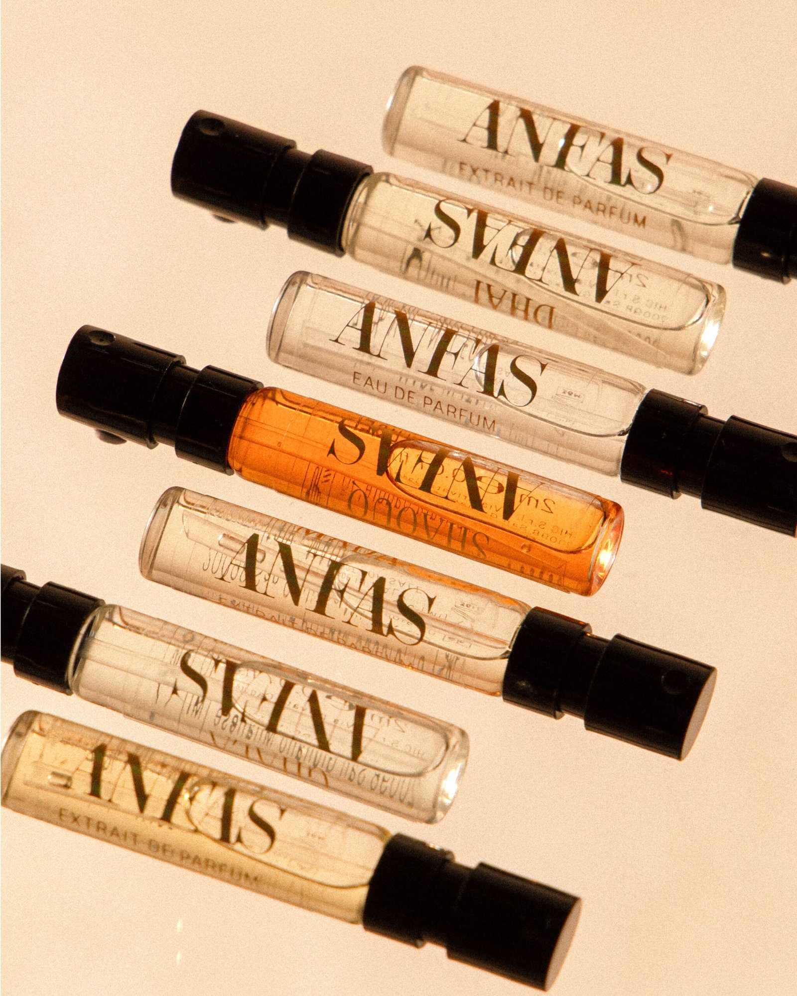
The new identity works in layers: a serif logotype that recalls tradition, a circular symbol that suggests ritual and breath. The visual system is built to behave — precise in tone, open in pace.
Packaging was developed to reflect restraint and material depth. Printed on @fedrigoni.paper with embossed structures and minimal interference, the physical experience matches the olfactive one. Everything that’s visible carries weight; everything that isn’t, breathes.
The e-commerce platform extends this logic: slow scroll, monochrome palette, layered interface. Navigation is clear but atmospheric. Product pages behave like visual essays.
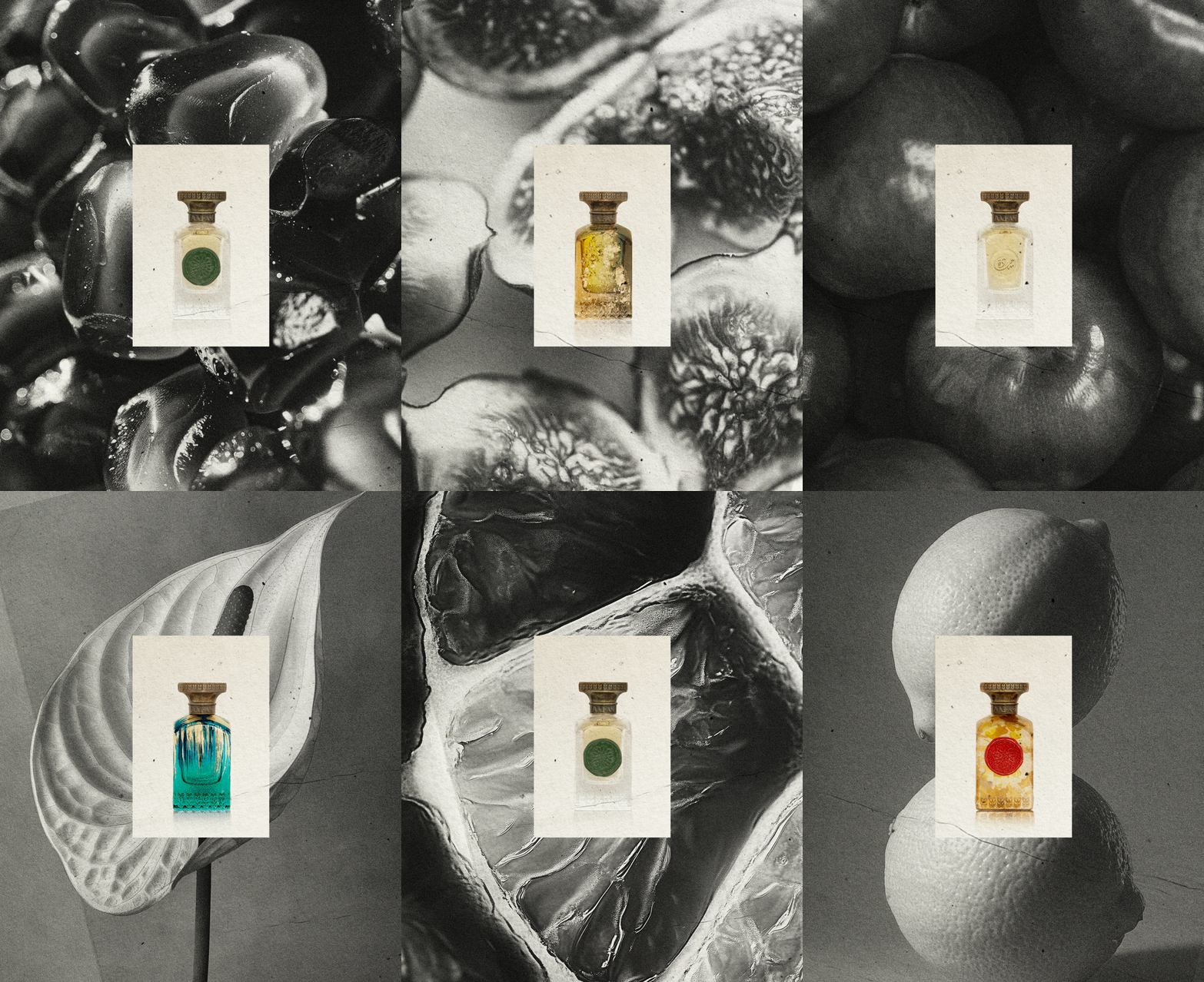
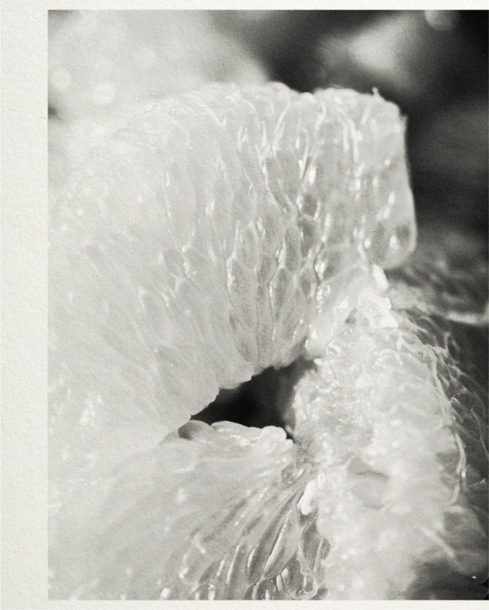
Photography by @javiermarquezphoto captures intimacy and pause. Video direction by @farra______________visual focuses on material, gesture, and transition.
This is not a redesign. It’s a reorientation — a way of aligning brand presence with brand intention, across print, digital, and space.
Services:
Brand Strategy, Naming, Visual Identity, Packaging Design, Website, Art Direction
Client: Anfas Collection
Type: Niche Perfume Branding
Website: anfascollection.com
—
Credits
Photo: @javiermarquezphoto
Video: @farra______________visual
Typefaces: Victor Narrow, Canela, custom glyphs


