DOMINGO(TM) was invited to define the brand concept and visual identity for the club. The challenge was not just to make it visible, but to make it meaningful - reflecting both the dynamic nature of padel and the welcoming tone of the space.
Identity
La Casa Del Padel
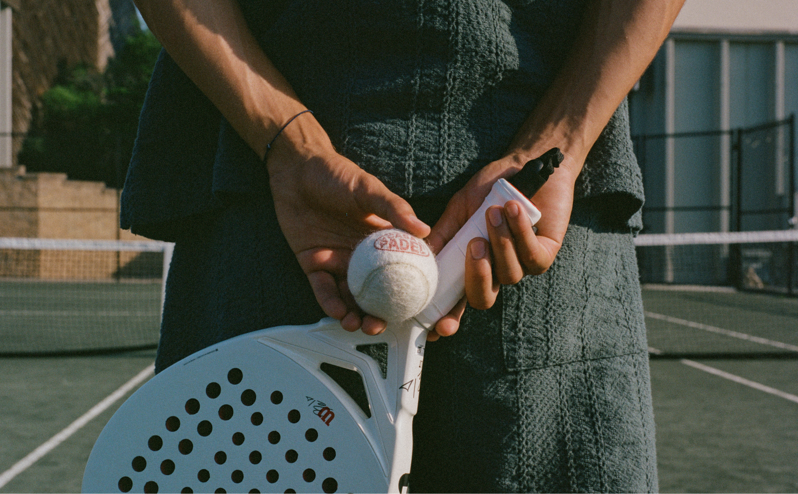
La Casa del Padel is a club born from energy, competition, and a need for connection. Based in Kansas City, it's more than a place to play - it's a growing community shaped around sport and social life.
Branding
We gave La Casa Del Padel a language for its essence, rooted in its context and reinterpreted through a contemporary lens.
Creative direction / Brand system
The Challenge
La Casa del Padel is a club born from energy, competition, and a need for connection. Based in Kansas City, it's more than a place to play - it's a growing community shaped around sport and social life.
DOMINGO(TM) was invited to define the brand concept and visual identity for the club. The challenge was not just to make it visible, but to make it meaningful - reflecting both the dynamic nature of padel and the welcoming tone of the space.
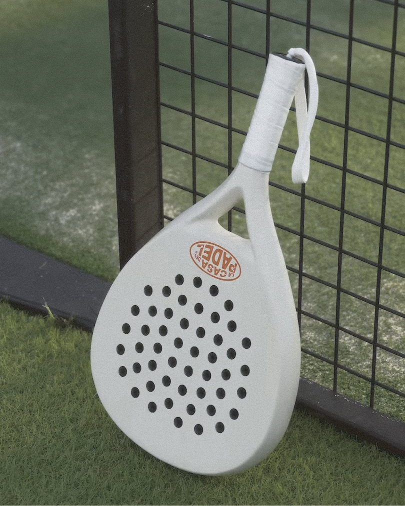
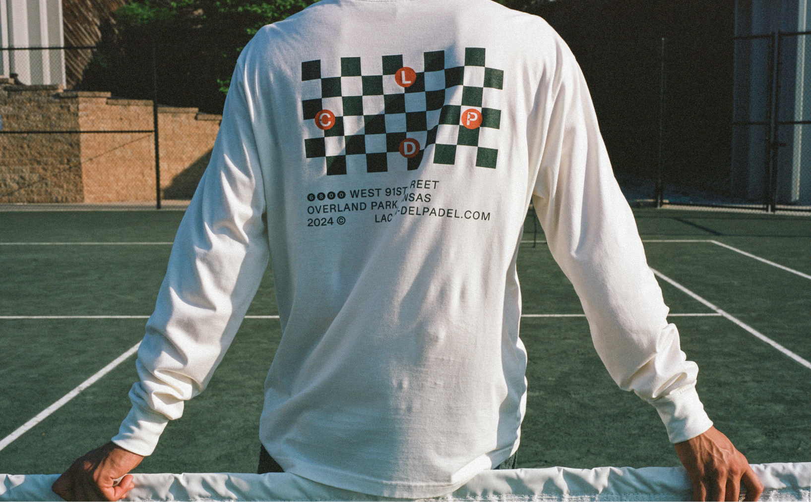
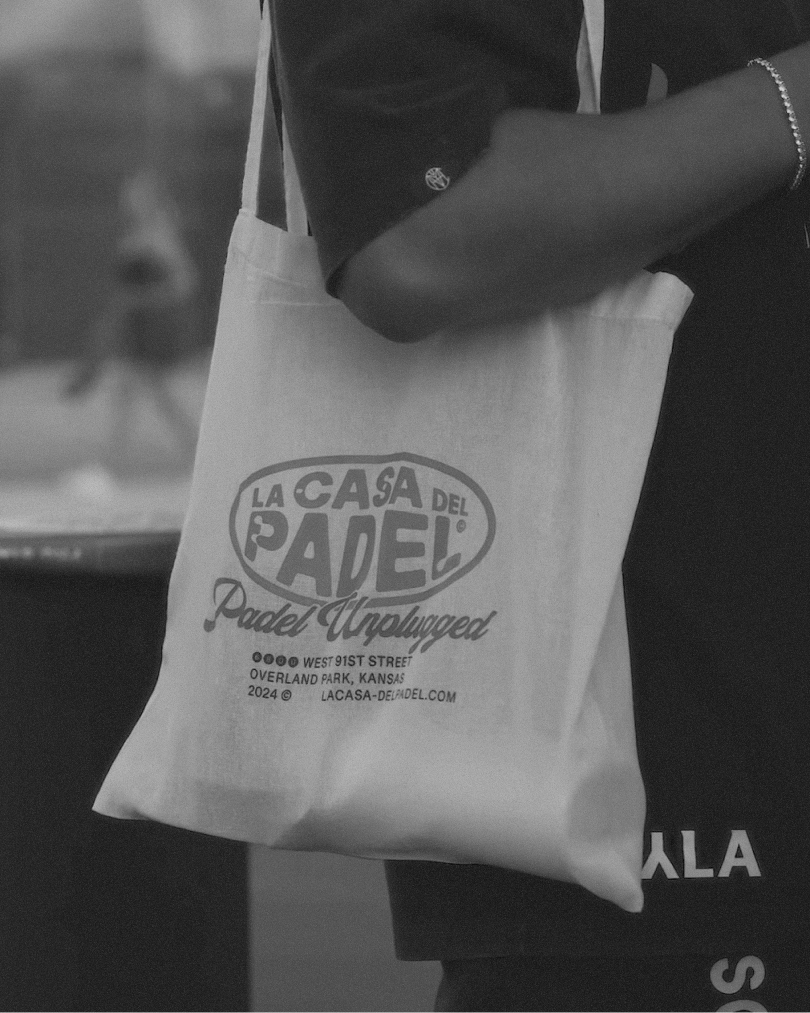
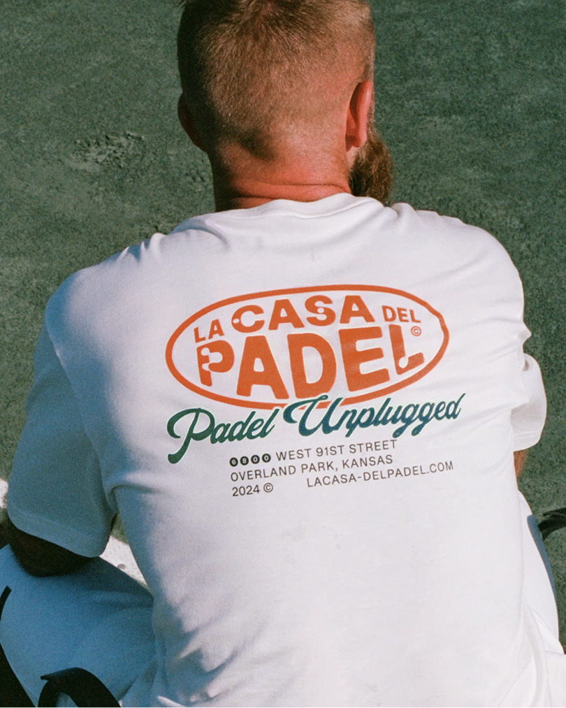
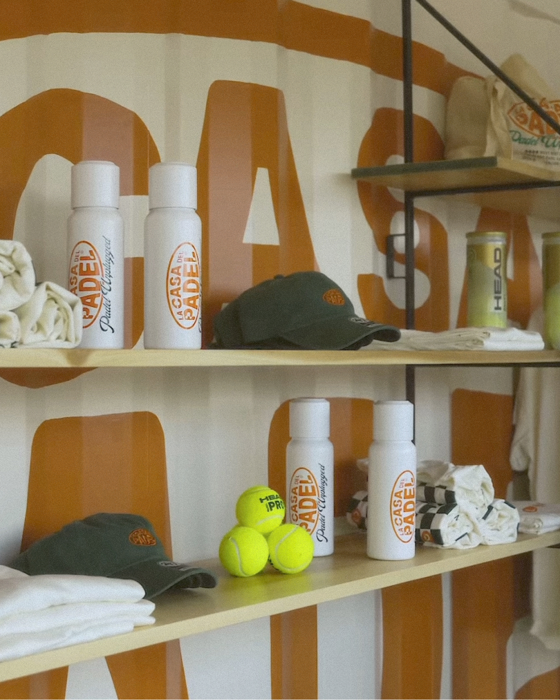
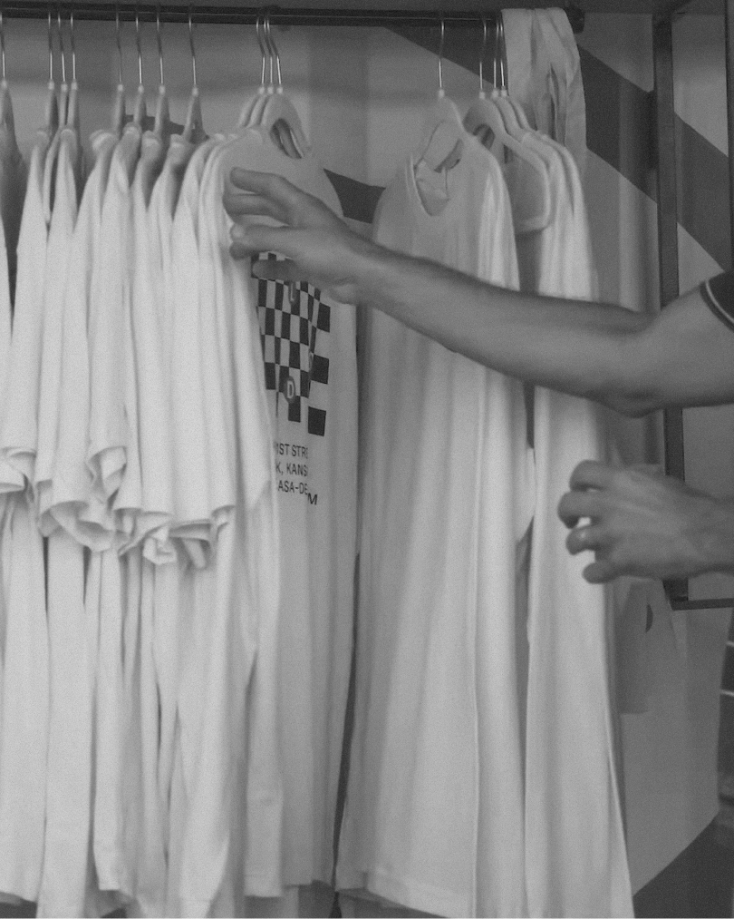
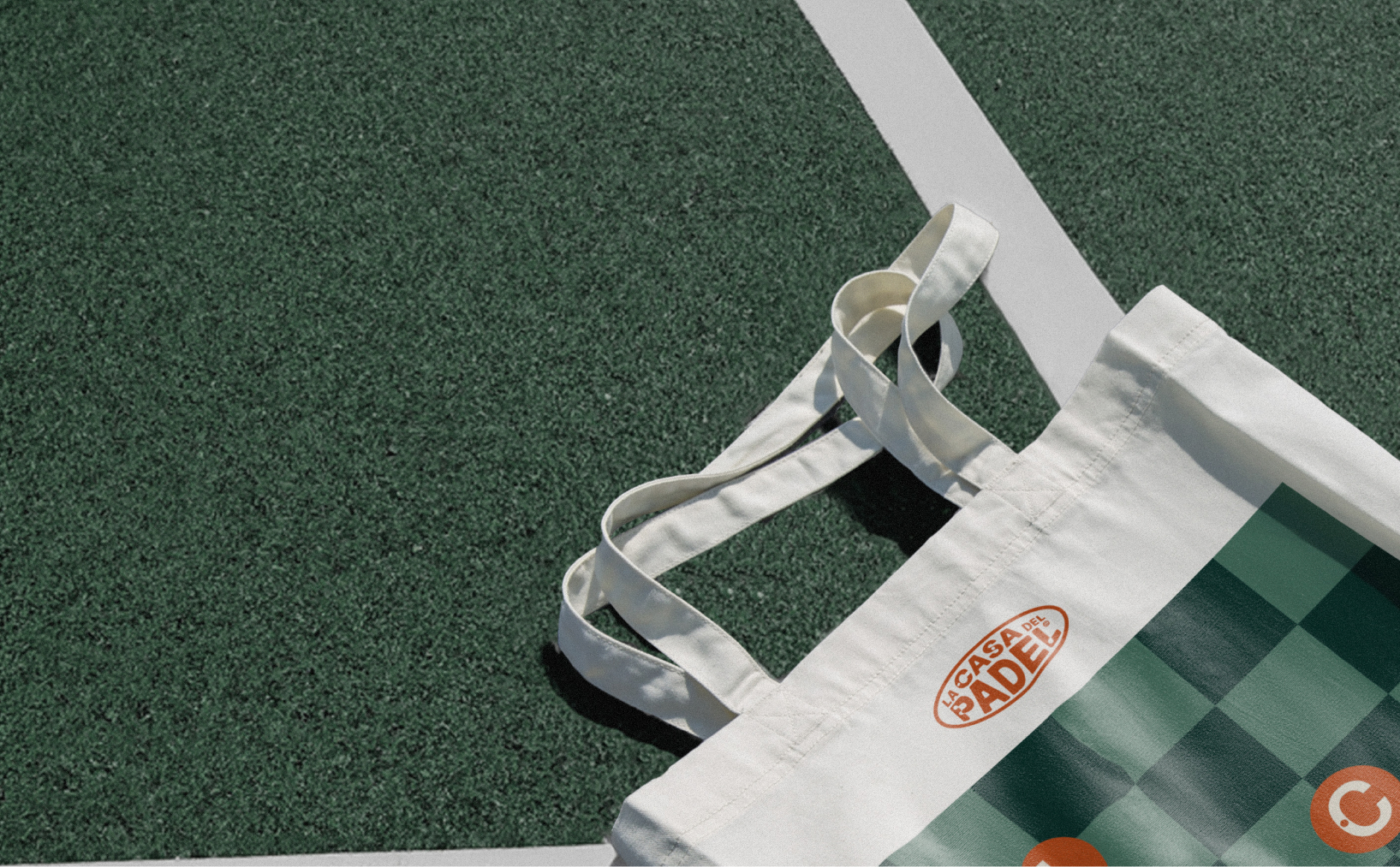
We developed a bold, accessible brand system rooted in rhythm and repetition. Typography is strong and direct, inspired by movement. The logotype is modular, designed to adapt to formats ranging from uniforms to signage to digital communication.
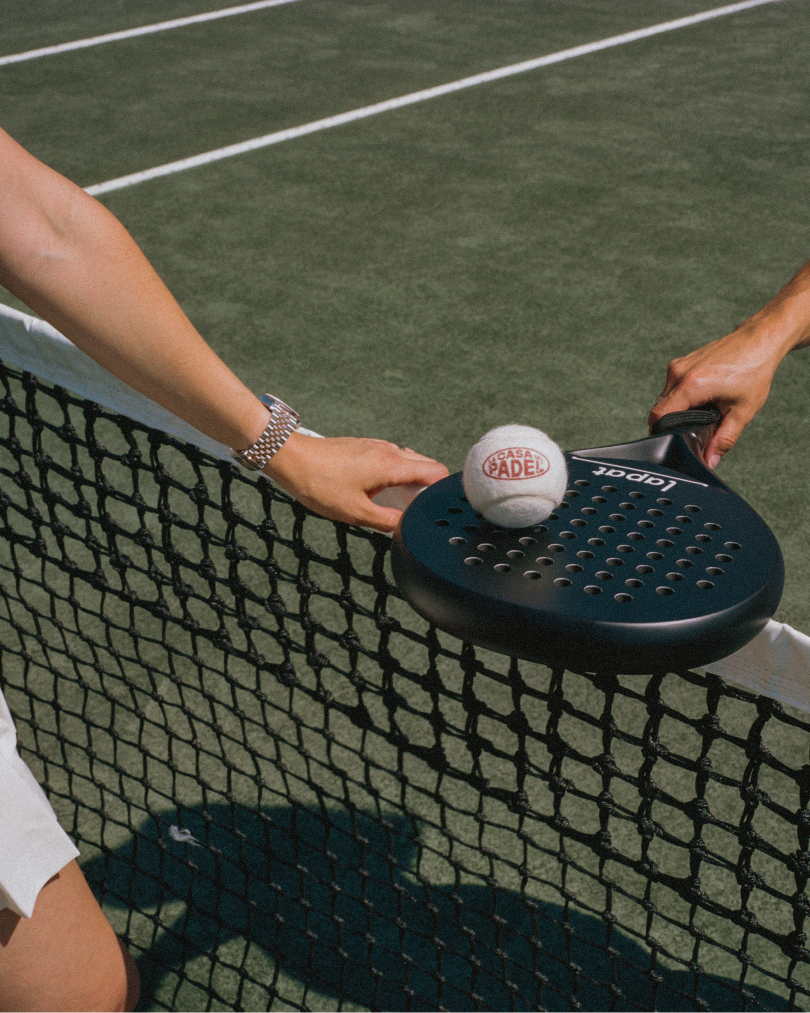
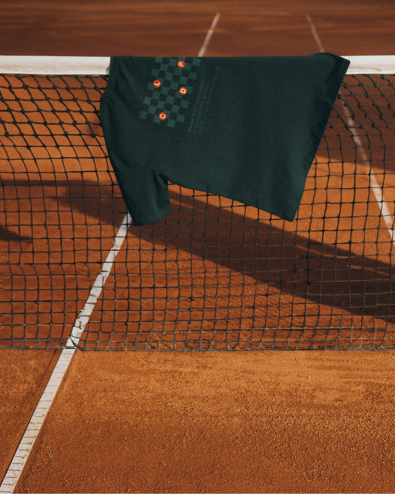
The brand colors - vibrant green and solid black - reference both the court and the city. Shapes and graphics evolve from the game's geometry: arcs, nets, rebounds.
Our focus was on building a language that could grow with the club. A system that feels inclusive for beginners, confident for competitors, and authentic for the founders.
This is branding for a space that moves - and invites others to move with it.
**Services:** Brand Concept, Estrategia de Marca, Identidad Visual **Client:** La Casa del Padel **Location:** Kansas City, USA **Sector:** Sport & Lifestyle
The Adjustment
La Casa del Padel is a club born from energy, competition, and a need for connection. Based in Kansas City, it's more than a place to play - it's a growing community shaped around sport and social life.
DOMINGO(TM) was invited to define the brand concept and visual identity for the club. The challenge was not just to make it visible, but to make it meaningful - reflecting both the dynamic nature of padel and the welcoming tone of the space.
We developed a bold, accessible brand system rooted in rhythm and repetition. Typography is strong and direct, inspired by movement. The logotype is modular, designed to adapt to formats ranging from uniforms to signage to digital communication.
The brand colors - vibrant green and solid black - reference both the court and the city. Shapes and graphics evolve from the game's geometry: arcs, nets, rebounds.
Our focus was on building a language that could grow with the club. A system that feels inclusive for beginners, confident for competitors, and authentic for the founders.
This is branding for a space that moves - and invites others to move with it.
**Services:** Brand Concept, Estrategia de Marca, Identidad Visual **Client:** La Casa del Padel **Location:** Kansas City, USA **Sector:** Sport & Lifestyle
The Brand Promise
La Casa del Padel is a club born from energy, competition, and a need for connection. Based in Kansas City, it's more than a place to play - it's a growing community shaped around sport and social life.
DOMINGO(TM) was invited to define the brand concept and visual identity for the club. The challenge was not just to make it visible, but to make it meaningful - reflecting both the dynamic nature of padel and the welcoming tone of the space.
We developed a bold, accessible brand system rooted in rhythm and repetition. Typography is strong and direct, inspired by movement. The logotype is modular, designed to adapt to formats ranging from uniforms to signage to digital communication.
The brand colors - vibrant green and solid black - reference both the court and the city. Shapes and graphics evolve from the game's geometry: arcs, nets, rebounds.
Our focus was on building a language that could grow with the club. A system that feels inclusive for beginners, confident for competitors, and authentic for the founders.
This is branding for a space that moves - and invites others to move with it.
**Services:** Brand Concept, Estrategia de Marca, Identidad Visual **Client:** La Casa del Padel **Location:** Kansas City, USA **Sector:** Sport & Lifestyle
What we offered
La Casa del Padel is a club born from energy, competition, and a need for connection. Based in Kansas City, it's more than a place to play - it's a growing community shaped around sport and social life.
DOMINGO(TM) was invited to define the brand concept and visual identity for the club. The challenge was not just to make it visible, but to make it meaningful - reflecting both the dynamic nature of padel and the welcoming tone of the space.
We developed a bold, accessible brand system rooted in rhythm and repetition. Typography is strong and direct, inspired by movement. The logotype is modular, designed to adapt to formats ranging from uniforms to signage to digital communication.
The brand colors - vibrant green and solid black - reference both the court and the city. Shapes and graphics evolve from the game's geometry: arcs, nets, rebounds.
Our focus was on building a language that could grow with the club. A system that feels inclusive for beginners, confident for competitors, and authentic for the founders.
This is branding for a space that moves - and invites others to move with it.
IMG.
Identity
La Casa del Padel is a club born from energy, competition, and a need for connection. Based in Kansas City, it's more than a place to play - it's a growing community shaped around sport and social life.
IMG.
Brand system
We developed a bold, accessible brand system rooted in rhythm and repetition. Typography is strong and direct, inspired by movement. The logotype is modular, designed to adapt to formats ranging from uniforms to signage to digital communication.
Nos pondremos en contacto contigo en los próximos días, probablemente con un enlace para agendar una reunión y conocer mejor el proyecto.
COOKIES PREFERENCE
We use essential browser storage to remember your cookie preference. If analytics are enabled, we also use privacy-conscious analytics and heatmap tools to understand how the website is used and improve the experience.
To learn more about cookies and how we use them, please view our Privacy Policy. Disabling cookies may limit some content and targeted advertising, but you may disable cookies by changing your browser preferences or changing your cookie preferences below.
To provide the best experiences, we use technologies like cookies to store and/or access device information. Consenting to these technologies will allow us to process data such as browsing behavior or unique IDs on this site. Not consenting or withdrawing consent, may adversely affect certain features and functions.
Functional
Siempre activo
The technical storage or access is strictly necessary for the legitimate purpose of enabling the use of a specific service explicitly requested by the subscriber or user, or for the sole purpose of carrying out the transmission of a communication over an electronic communications network.
Preferences
The technical storage or access is necessary for the legitimate purpose of storing preferences that are not requested by the subscriber or user.
Statistics
The technical storage or access that is used exclusively for statistical purposes.The technical storage or access that is used exclusively for anonymous statistical purposes. Without a subpoena, voluntary compliance on the part of your Internet Service Provider, or additional records from a third party, information stored or retrieved for this purpose alone cannot usually be used to identify you.
Marketing
The technical storage or access is required to create user profiles to send advertising, or to track the user on a website or across several websites for similar marketing purposes.