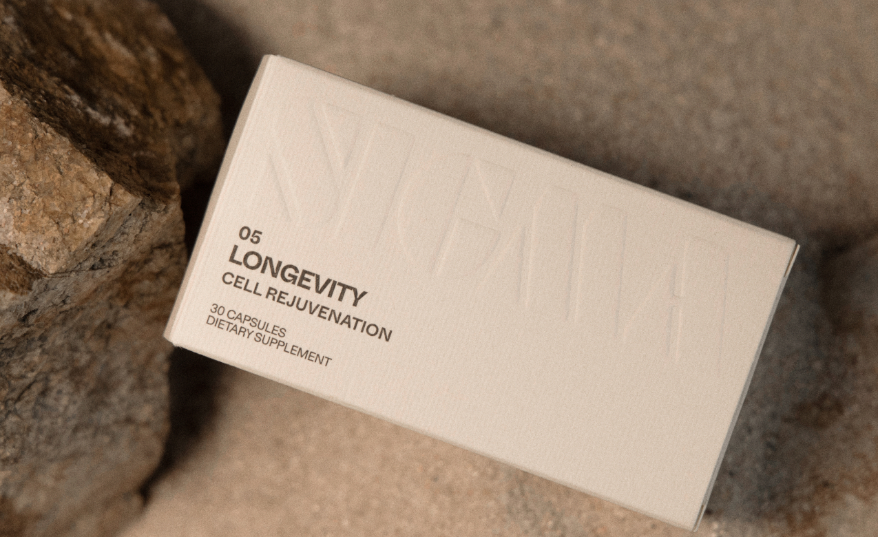
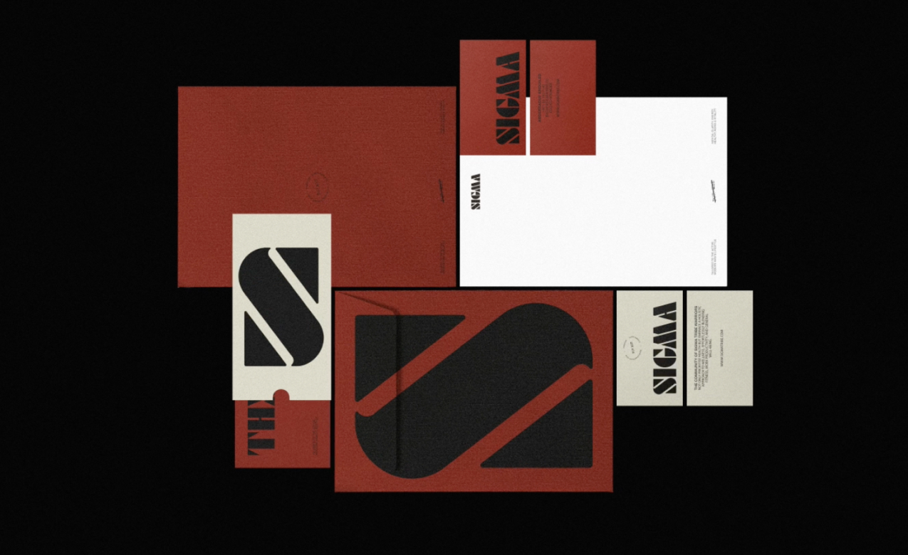
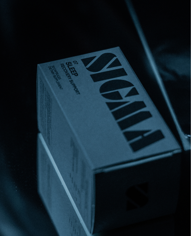
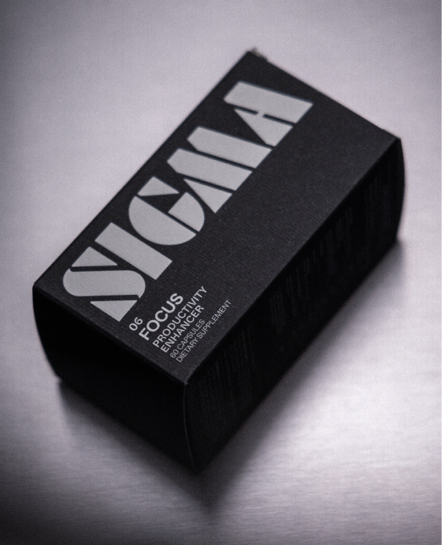
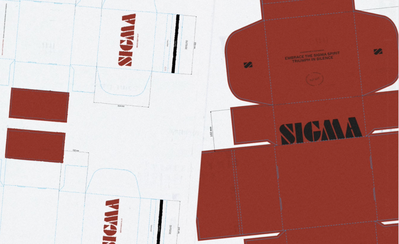
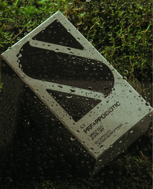
The project began with positioning and tone. A brand that doesn't shout, but moves with precision. We translated that idea into type, spacing, form, and material. The packaging avoids slogans. It leaves space. Every choice was made to hold meaning, not to explain it.
Identity
Sigma Tribe
Sigma Tribe is a daily supplements brand built on restraint, rhythm, and presence. We worked across brand strategy, visual identity, packaging, and web - shaping a system that speaks without excess.
Branding
We gave Sigma Tribe a language for its essence, rooted in its context and reinterpreted through a contemporary lens.
Creative direction / Brand system
The Challenge
Sigma Tribe is a daily supplements brand built on restraint, rhythm, and presence. We worked across brand strategy, visual identity, packaging, and web - shaping a system that speaks without excess.
The project began with positioning and tone. A brand that doesn't shout, but moves with precision. We translated that idea into type, spacing, form, and material. The packaging avoids slogans. It leaves space. Every choice was made to hold meaning, not to explain it.
Typography blends utility and character - ABC Whyte Inktrap and Diatype give structure; Futura Stencil offers pause. The logo is neither loud nor absent. It occupies its place.
The digital experience mirrors the physical: clear, monochrome, non-linear. A quiet interface where supplements branding becomes editorial.
More than a look, the system works like a filter - aligning story, behavior, and tone across all touchpoints.
The Adjustment
Sigma Tribe is a daily supplements brand built on restraint, rhythm, and presence. We worked across brand strategy, visual identity, packaging, and web - shaping a system that speaks without excess.
The project began with positioning and tone. A brand that doesn't shout, but moves with precision. We translated that idea into type, spacing, form, and material. The packaging avoids slogans. It leaves space. Every choice was made to hold meaning, not to explain it.
Typography blends utility and character - ABC Whyte Inktrap and Diatype give structure; Futura Stencil offers pause. The logo is neither loud nor absent. It occupies its place.
The digital experience mirrors the physical: clear, monochrome, non-linear. A quiet interface where supplements branding becomes editorial.
More than a look, the system works like a filter - aligning story, behavior, and tone across all touchpoints.
The Brand Promise
Sigma Tribe is a daily supplements brand built on restraint, rhythm, and presence. We worked across brand strategy, visual identity, packaging, and web - shaping a system that speaks without excess.
The project began with positioning and tone. A brand that doesn't shout, but moves with precision. We translated that idea into type, spacing, form, and material. The packaging avoids slogans. It leaves space. Every choice was made to hold meaning, not to explain it.
Typography blends utility and character - ABC Whyte Inktrap and Diatype give structure; Futura Stencil offers pause. The logo is neither loud nor absent. It occupies its place.
The digital experience mirrors the physical: clear, monochrome, non-linear. A quiet interface where supplements branding becomes editorial.
More than a look, the system works like a filter - aligning story, behavior, and tone across all touchpoints.
What we offered
Sigma Tribe is a daily supplements brand built on restraint, rhythm, and presence. We worked across brand strategy, visual identity, packaging, and web - shaping a system that speaks without excess.
The project began with positioning and tone. A brand that doesn't shout, but moves with precision. We translated that idea into type, spacing, form, and material. The packaging avoids slogans. It leaves space. Every choice was made to hold meaning, not to explain it.
Typography blends utility and character - ABC Whyte Inktrap and Diatype give structure; Futura Stencil offers pause. The logo is neither loud nor absent. It occupies its place.
The digital experience mirrors the physical: clear, monochrome, non-linear. A quiet interface where supplements branding becomes editorial.
More than a look, the system works like a filter - aligning story, behavior, and tone across all touchpoints.
IMG.
Identity
Sigma Tribe is a daily supplements brand built on restraint, rhythm, and presence. We worked across brand strategy, visual identity, packaging, and web - shaping a system that speaks without excess.
IMG.
Brand system
Typography blends utility and character - ABC Whyte Inktrap and Diatype give structure; Futura Stencil offers pause. The logo is neither loud nor absent. It occupies its place.
Nos pondremos en contacto contigo en los próximos días, probablemente con un enlace para agendar una reunión y conocer mejor el proyecto.
COOKIES PREFERENCE
We use essential browser storage to remember your cookie preference. If analytics are enabled, we also use privacy-conscious analytics and heatmap tools to understand how the website is used and improve the experience.
To learn more about cookies and how we use them, please view our Privacy Policy. Disabling cookies may limit some content and targeted advertising, but you may disable cookies by changing your browser preferences or changing your cookie preferences below.
To provide the best experiences, we use technologies like cookies to store and/or access device information. Consenting to these technologies will allow us to process data such as browsing behavior or unique IDs on this site. Not consenting or withdrawing consent, may adversely affect certain features and functions.
Functional
Siempre activo
The technical storage or access is strictly necessary for the legitimate purpose of enabling the use of a specific service explicitly requested by the subscriber or user, or for the sole purpose of carrying out the transmission of a communication over an electronic communications network.
Preferences
The technical storage or access is necessary for the legitimate purpose of storing preferences that are not requested by the subscriber or user.
Statistics
The technical storage or access that is used exclusively for statistical purposes.The technical storage or access that is used exclusively for anonymous statistical purposes. Without a subpoena, voluntary compliance on the part of your Internet Service Provider, or additional records from a third party, information stored or retrieved for this purpose alone cannot usually be used to identify you.
Marketing
The technical storage or access is required to create user profiles to send advertising, or to track the user on a website or across several websites for similar marketing purposes.