The Name
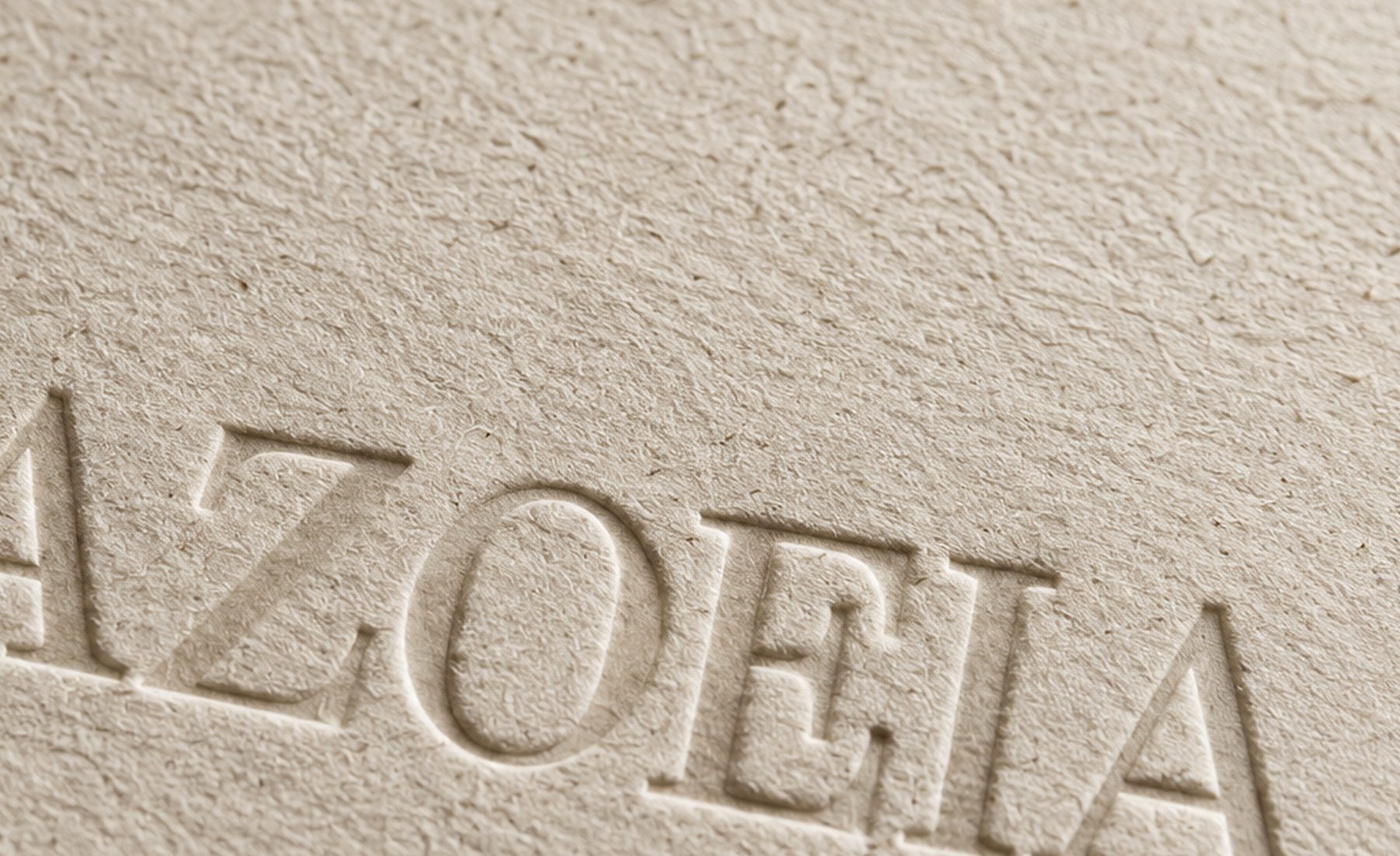
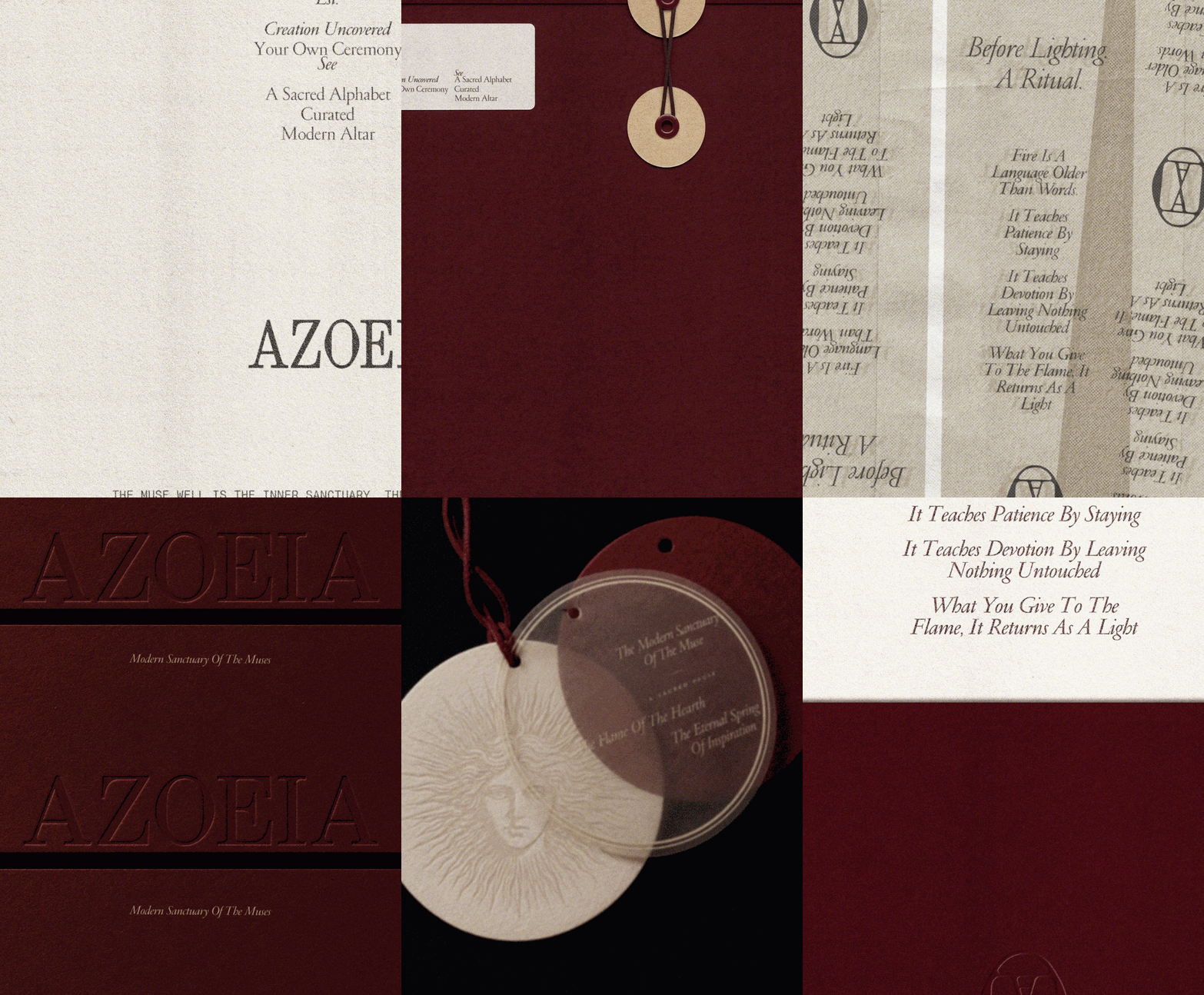
AZOEIA moves from A to EIA: a sacred alphabet that frames light as the beginning of creation.

Brand Identity
AZOEIA
Brand Strategy · Brand Identity · Art Direction · Packaging
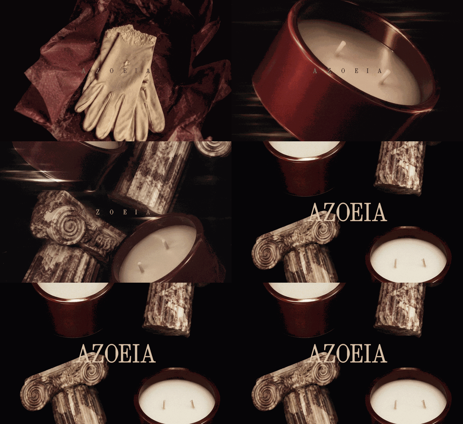
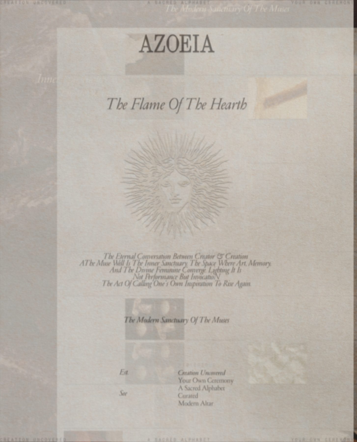
The Flame Of The Hearth
The System
An Alphabet Of Light, Built From Ritual, Material And Flame.
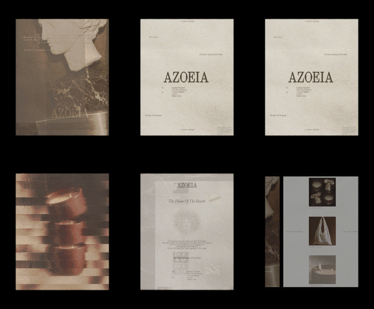
Type — PF Garamond & PP Neue Montreal Mono
AZOEIA moves from A to EIA: a sacred alphabet that frames light as the beginning of creation.
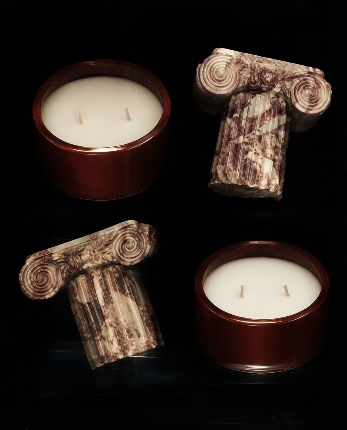
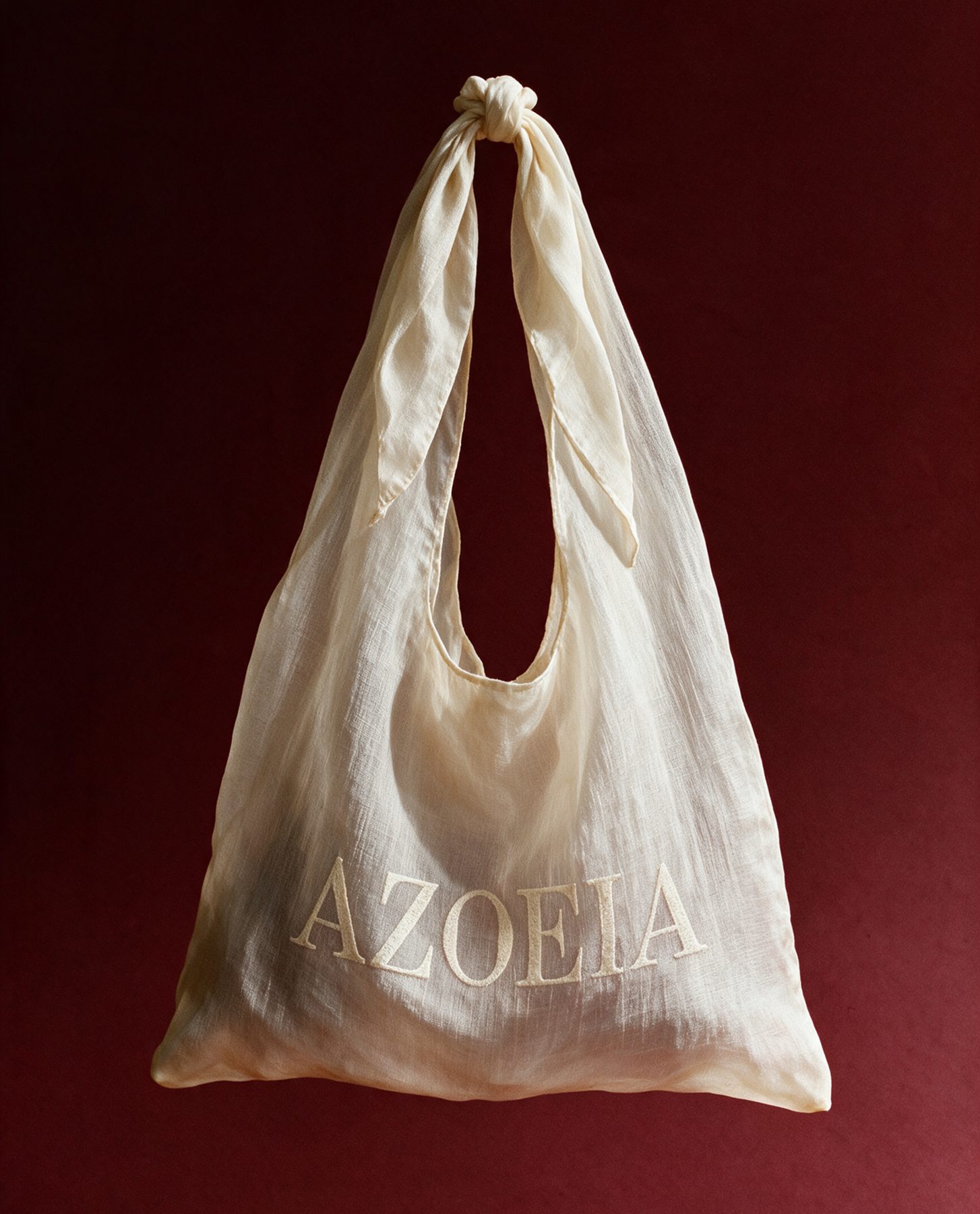
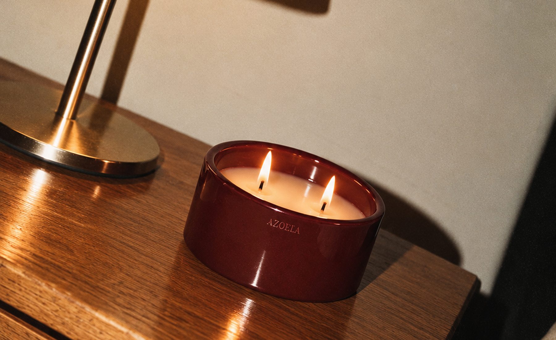
Oxblood, amber and warm ivory give the identity its heat, depth and tactile sense of ceremony.
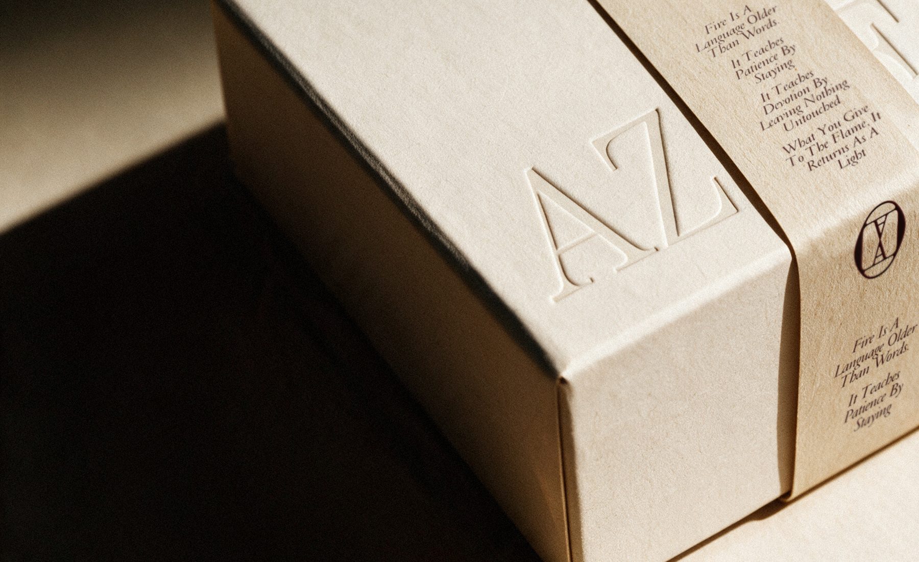
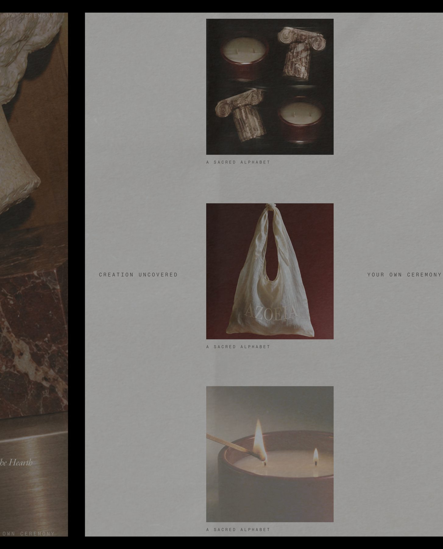
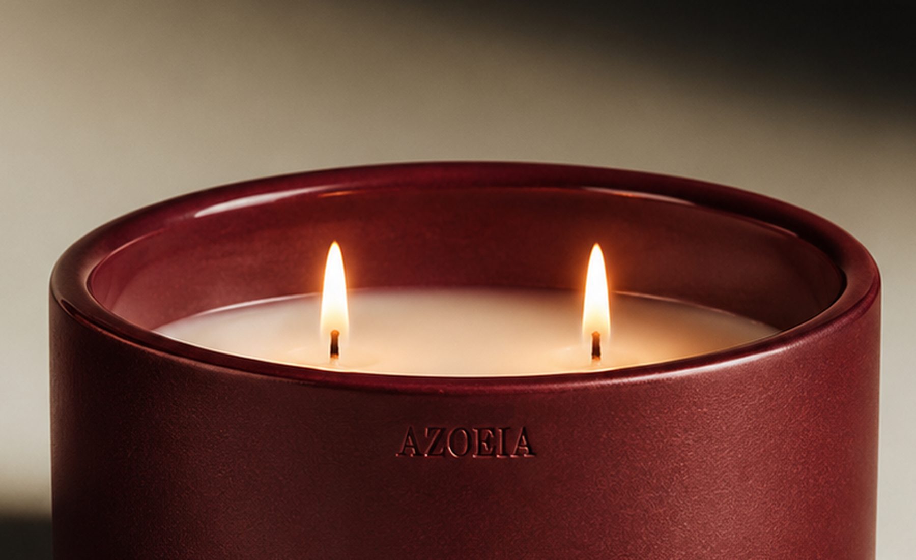
The flame becomes punctuation—small, deliberate and present across packaging, print and image making.
What we offered
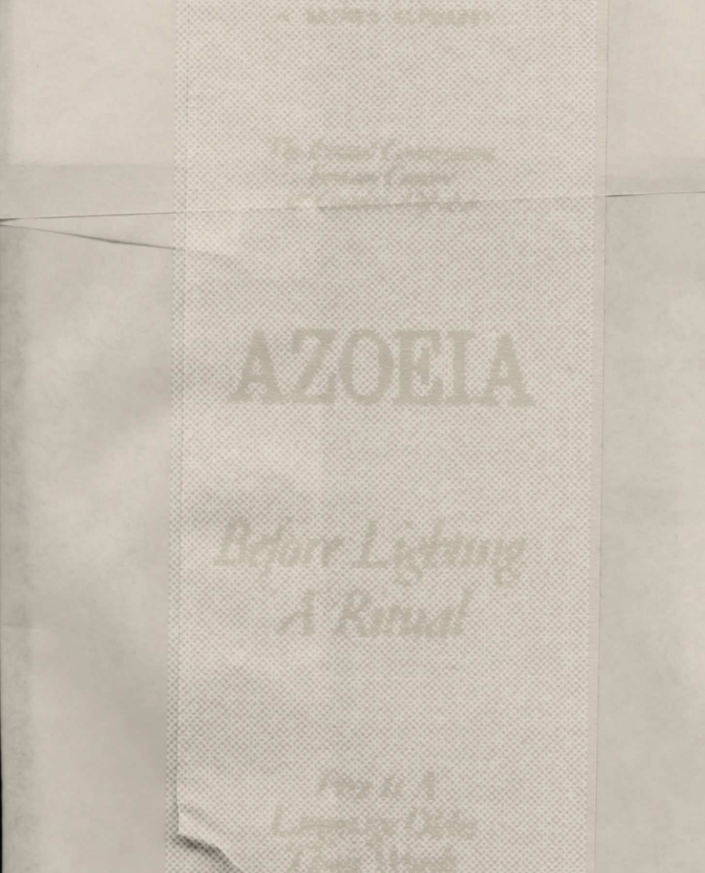
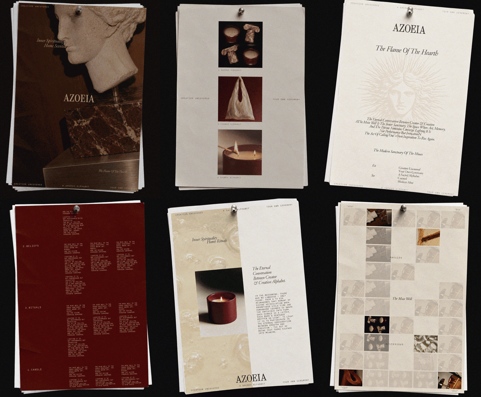
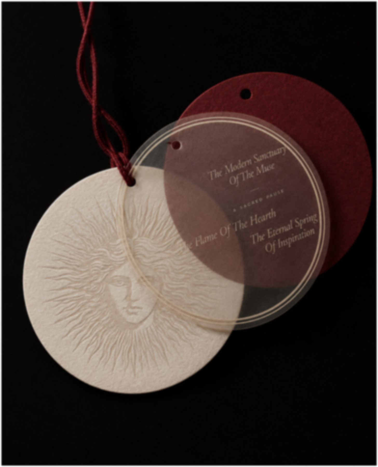
The identity pairs a classical serif with a precise mono voice, balancing myth and utility. Packaging, printed matter and art direction treat the flame as punctuation: one deliberate mark inside a restrained, material system.
Brand Strategy · Brand Identity · Art Direction · Packaging


Brand system
Fire Is A Language Older Than Words. AZOEIA Gives It A System.
